The admin area: everything the machine is doing, on one screen
· 7 min read · Tim Thomas
Twenty-six tabs, built by asking for them. What a one-person company's control room looks like when the person is not the one writing the dashboards.
Every product that runs on its own needs a room where you can see it running. Big companies build that room with a team and a budget line. I built mine by describing what I wanted to know, one question at a time, and it grew into the thing in the screenshots below.
It lives at a private address, behind a token, and it is the first thing I open in the morning. Here is what is in it, and why.
The numbers at the top
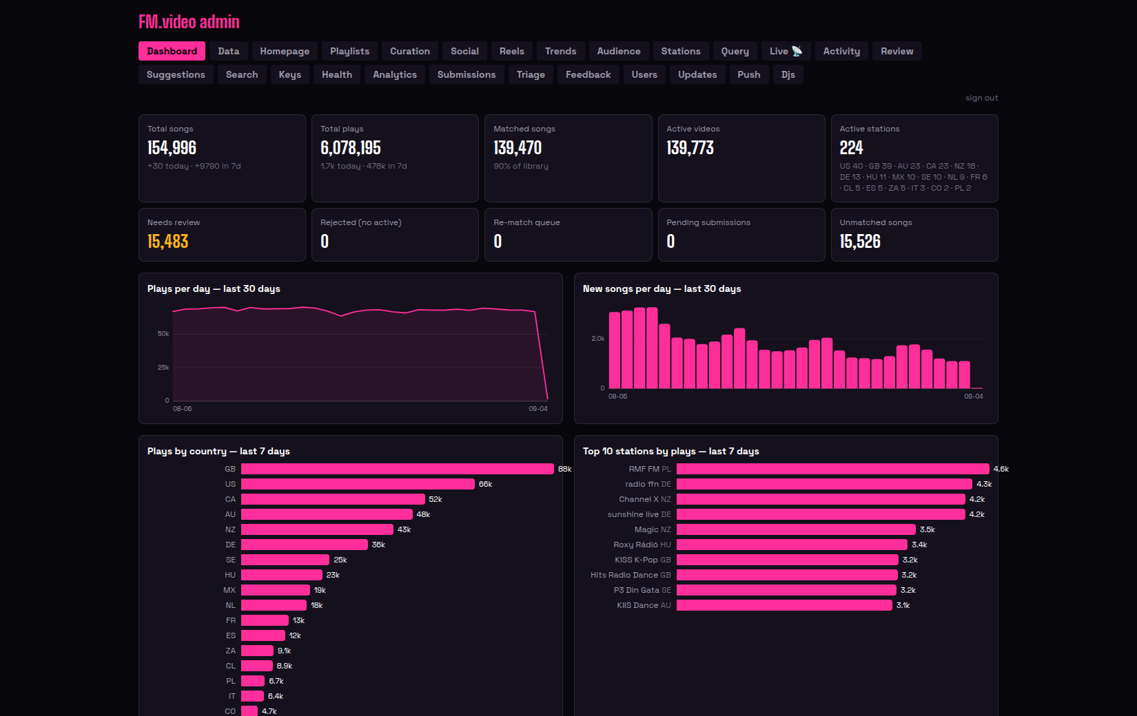
The dashboard opens with the totals that tell me whether the engine is healthy: total songs (154,951 as I write this), total plays (six million and counting, about 66,000 a day), how many songs have a matched video (nine in ten), and how many stations are active, broken down by country. The second row is the work queue: songs that need a human eye, songs with no match yet, the re-match queue, pending station submissions.
Two of those numbers are big and yellow. About 15,000 songs are waiting for review. A library this size grows edge cases faster than one person can clear them, and the admin's job is to make clearing them fast, not to hide the pile.
Below that, thirty days of plays per day (flat, which is what you want), new songs per day (the library grows by a thousand or two a day), plays by country, and the ten busiest stations of the week. RMF FM in Poland and radio ffn in Germany usually top it.
The live tab
This is the one I stare at when I should be doing something else.
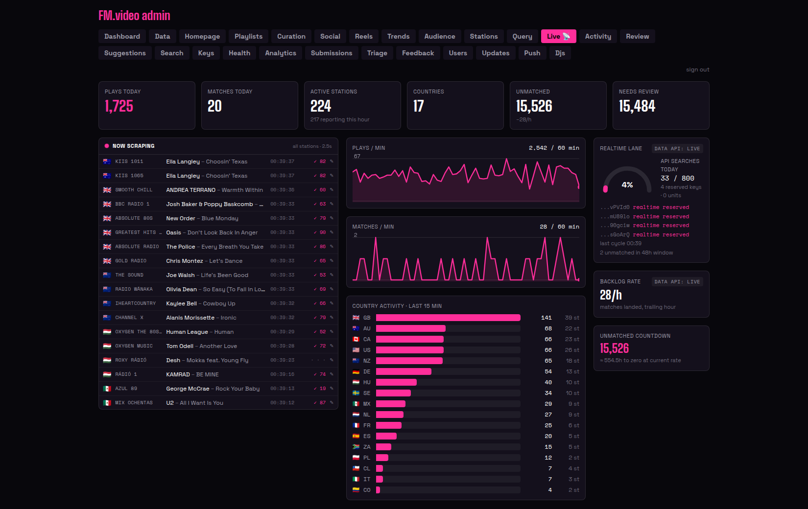
On the left, every station's most recent play as it lands, with a flag, the timestamp, and a tick with a score when the matcher has already found the video. That list refreshes every couple of seconds and it is the heartbeat of the whole system. If it goes quiet, something is wrong, and a separate monitor will already be messaging me.
In the middle, plays per minute and matches per minute over the last hour, and which countries are busiest right now (the UK is usually top; it is a big market and its stations report often). On the right, the realtime matching lane and the YouTube API budget: how many searches we have used today against the quota, how many keys are held in reserve, when the last cycle ran. Running out of quota at 3pm used to be a mystery. Now it is a gauge.
The other twenty-four tabs
I will not go through all of them, but the shape is worth describing, because it is the shape of what a small company actually needs to see.
Data quality. Review, Suggestions, Triage and Search are where a human corrects the machine: a matched video that is actually a live cover, a song that is two songs with different spellings, a station that has started sending garbage. The AI does a first pass on the review queue and auto-approves the confident ones, so what reaches me is the genuinely ambiguous. Curation is the hand-picked layer on top: the channels, the featured playlists, what the home page leads with.
Stations. Every station's health, its feed provider, when it last reported, and its genre. Submissions is the queue of stations people have asked us to add, with a probe that tests the feed before anyone touches it. Keys manages the pool of YouTube API keys that the matcher rotates through.
Audience. Analytics, Audience, Users and Feedback: who is watching, from where, what they are voting up and down on videos, what they have suggested. Push is the web push notifications. Djs is the programme where DJs and playlist makers get a profile and a channel.
Marketing. Social, Reels and Trends are the marketing department: the posting calendar, the reel factory's output with a swipe-to-rate desk, and what is trending on TikTok this week according to our own data. Updates is where the weekly radio reports and the hand-written posts are published.
Operations. Health, Activity and Query. Health is every timer and service with its last run and its last error. Activity is the matcher fleet log. Query is a report explorer over the whole database, because the question I need answered is never the one I thought of yesterday.
How it got built
Nobody designed this. Each tab exists because on some particular day I needed to know something and said so. "Why did the matcher pick that video?" became the picks gallery. "Which stations are reporting this hour?" became the live board. "How much YouTube quota is left?" became the gauge. The agent built each one in the same conversation, usually within the hour, in the same visual language as the product itself, because the brand is written down as code and the admin reads the same file.
That is the thing I keep coming back to. The admin area for a product used to be the part you never had time for, the part that stayed a spreadsheet and three terminal windows. Here it was the cheapest part to build, because asking for a view of something is much easier than building it, and the asking is all I do.
Twenty-six tabs is also, frankly, a lot. Some of them will merge. But every one of them answers a question I actually had, which is more than I can say for most dashboards I have paid for.
Next in this log: DevOps in the AI World.